By Blacksheep
An Untold Banner
On Sunday Tony and I were chewing over the bones of the game against Chelski and I put an idea to him. How about we (i.e the Untold family) fund a banner that can be displayed at the Emirates?
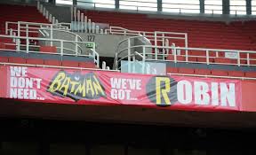
You probably know the sort of thing I mean if you been to the Grove or have only seen it on a dodgy stream.
or
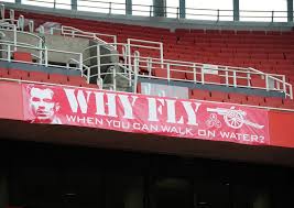
These celebrate victories (we won the league, at WHL) or former players (like Rocky or Dennis) but I think its about time we had one that saluted the greatest manager in Arsenal’s history.
I contacted the team at Red Action (who do so much to organize the huge banners on match day and are tasked with improving the atmosphere) and they provided the following information:
If we want to do this we need to design a banner that is exactly 1m high and is about 5m wide (this can vary but there isn’t unlimited space). It has to be made from fireproof vinyl (and I have a specific manufacturer to contact).
Before we get it made we have to contact the Supporter Liason team at Arsenal to get approval. Once they ok it we can get it made, deliver it to the club and they will install it.
Costs will vary but I reckon we might need £150-£250 and this might be a project that Untolders would like to chip in to (as much or as little as you like).
Then we have the design – now I was thinking we should use the quote that appears at the masthead of this blog:
“I believe the target of anything in life should be to do it so well that it becomes an art” with a silhouette of Arsene Wenger. In red on a white background perhaps?
What do you think? Got a better idea then do share. Want to get involved or pledge money? Let me know @blacksheep63 on twitter
Let’s do this!
Blacksheep

First thing: I hope that first banner is no longer hanging 😉
Second thing: I LOVE THE IDEA VERY MUCH!!!
I sure would like to help in paying a bit of money. I decided to spend the referee money I got from my last match on this. That should be around £25 from my part. Just let me know when, where, what and I will transfer the money.
I think that it would make sure that Untold and the spirit of Untold is always present in the stadium on match days.
And our supporters club is also planning to buy a banner with our name on it so in that way I would always feel inside the stadium twice in fact.
As I’m not good at designing things I leave that to people who know more about that than I. I love the quote but wouldn’t it be too long (hence letters too small) for a 5 meter banner?
Great idea , will match Walter’s contribution . If there is more than enough collection ,what about a “There’s only one WHATSHISNAME ” banner too ? That ought to piss ‘them’ off !
@brickfields
Rather ‘you sure know WHATSHISNAME’
I would love to contribute to the untold banner, irrespective of the content.
2 ARSENAL 13 – April 30, 2015 at 8:13 am – We AKBs all love Ramsey and will always cheer him on , but this banner would make Piss Morgan red in the face !
I believe there is already a “Whatshisname’ on the back of an Arsenal jersey , by a reader on here !
If you are prepared to have a Chelsea badge on the banner I might be persuaded to thrown in 50p
Post details of where to send that dunza(money).
For a laugh. . .
“We untold you so!”
No idea what to put on it, but great idea. Something about Mr Wenger would be good.
Could have a picture of Riley and a caption along the lines of keeping football honest……a complete untruth of course, but he might start being nicer to us!
I reckon the “art” quote is prone to graffiti—ie someone will add an F in front. Perhaps something like “only one Arséne Wenger”?
Great idea for all true gooners. Can we site BOTH banners where the T.V. cannot miss them?
I will contribute £25 to each banner.
Untold, you have my details so let me know when and where.
Just a question on this, how can the enormous flag that goes across the north bank come under these rules?
What a great positive site this is. Should we not get “Untold’s” name across to the fans as well?
Another £25 for that banner….hope the wife doesn’t read this!!
Great idea gents … might I suggest Kickstarter, or one of the other similar sites, as a good way to raise the cash and process things …
Would love to contribute as well!
Blacksheep, put me down for £25 as well.
I would like to contribute but i do not have twitter 🙁
I’m in with £25 as well. ‘Wenger the Football Composer -music on grass’
‘Welcome to the Arsene Wenger Stadium’
Blacksheep – set up the point of payment receipt & publish it here.
While you are at it set up 3 Untolders to judge the ideas so that it does not take up too much time or we could vote here if the ideas were published with numbers.
Great idea it will bring Untold into the limelight.
@Walter I think the first poster was for Rocky as in Rocking Robin & not for RVP.
@Blacksheep: great idea and I will contribute £25 as well.
@Walter: two from Belgium!
Put me down for £25. At this rate we can have banners all round the stadium!
Think it’s a great idea and would have a preference towards a pro Arsene idea as he is the one who gets most grief whilst doing his damndest for our club, am glad to donate what seems the going rate of £25 for this to happen, would also love pics (artists impressions of you were) of options to view or vote on as and when this gets moving.
Shouldn’t we have the name Untold Arsenal in it somewhere?
Is there anyone out there who can design a few things and send them to Untold?
Mike T, we could add a picture of a bus somewhere? 😉 😉
Looks like we’ve raised enough for 5 banners already.. Way to go.
you lot are amazing, when Tony gets back from jiving around Prague we will put our heads together and produce some designs to choose from.
Thank you all!
Vive la Professuer!
Count me in 🙂
@Walter – LOL the bus LOL 😉 😉
@Blacksheep63
Just messaged you. You have my support for a few quid.
“Arsenal Football Club – Negotiating parked buses since 1886”
Mandy, “Could have a picture of Riley…” 🙂
Beautiful.
Count me in….
Good idea. I have reservations about whether the masthead quote is best,though.
If the aim is defiance – we know what this quote means, we endorse it, f*** you, ingrates- it’s a good one.
If you find the thought unpleasant of it being misinterpreted, willfully or through ignorance, then not so much.
The key connection is surely ‘do something so well’ and ‘art’, meaning both that you can give yourself a good chance of victory and do so with something exciting and satisfying for reasons other than the sheer fact you won. But it will be read by fools as an endorsement of the idea art is favoured over victory, or art will be pursued to the detriment of victory. That he’s ok with losing so long as it’s pretty or fancy. We know that’s nonsense, but do idiots? (Can you bear to hear the truth you’ve spoken twisted by knaves to make a trap for fools?)
Shame you couldn’t fit all of Kipling’s If on there, and that the whole poem and particularly the end has been damaged a little by over-use.
http://www.poetryfoundation.org/poem/175772
I find it does a phenomenal job of evoking what Wenger’s about, what he’s faced and how he has faced it.
If you can fill the unforgiving minute
With sixty seconds’ worth of distance run,
Yours is the Earth and everything that’s in it,
And—which is more—you’ll be a Man, like Arsene
I’m looking forward to seeing which ideas come forward.
Meanwhile here’s the moany bus parking song:
https://m.youtube.com/watch?v=CVPNTekiE6o
This is nominally a desktop publishing task. Adobe PageMaker was “the” software. I am a Linux person, and Scribus is the software for this on the FOSS world. I recently made a 16″ by 20″ poster with scribus, and then had PosteRazor divide this large field into four 8.5×11 sheets that overlap slightly for printing.
You probably want to do all design in “points” (not inches or mm). 2834 points is just under 1m and 5m is just under 14173 points. The place that makes the poster can probably work with the scribus output directly, but for people doing the design you probably want to print out select parts onto letter paper to see what it looks like. The output from PosteRazor is a multipage PDF, and you can use ordinary PDF display software to print select pages. For the trial work with paper and PosteRazor, you want scribus to export something like a PNG image.
The size of a letter obviously goes a long way above the baseline, it also goes a significant distance below the line. The largest letter in my little poster was about 3 inches tall, which is about 220 points. But I think the actually typesize I had used in scribus was 340 point for this.
For the work you are doing, you could easily end up with text at 1000 point or more.
If your work is going to include imagery, it is best if the images come into scribus in a vector format like SVG.
You will probably set up the image as multiple “layers”, and you can specify opacity for layers and re-arrange the ordering. The default is a 1 layer page where the layer is called “Background”. The name of the layer is just a label, you can put the Background layer in the foreground if you want to.
Great idea. I would love to be involved. Let know how to send my contribution. I am base in Nigeria where decent transaction is cumbersome.
I looked at web sites for half a dozen poster printing places in London, and none of them say what kind of files they can work with. A person would be best to ask. One place said a 5m long poster 1m tall is (or probably more correctly starts at) 100 pounds. I would imagine it is similar to business cards, that is the 1 colour price. Multiple colours increases the price.
In terms of design, what formats are people capable of working in? Are people going to want to receive a 40 megapixel image?
@walter
do you mean an open bus?
Dare I suggest that you already have the wording . See banner at top of home page
Using:
“I believe the target of anything in life should be to do it so well that it becomes an art.”
on a 2834 point high by 14173 point long page. If I use the default typeface (Arial Regular) at 350 point size, the above slogan takes up most of the 5m width of the (landscape) page, but it takes up significantly less than 1/4 of the height.
As near as I can tell, the typeface used in the banner at Untold is Arial Negreta, which is not on my shopping list of typefaces.
Oops, that commit didn’t work worth a darn.
If I increase the type size to 700 point, the slogan takes up most of 2 lines, where scribus is controlling the line spacing. These 2 lines of text take up a bit over 50% of the vertical height of the (landscape) “page”.
Anyone know of the whereabouts of art, namely a silhouette of AW?
I am still working with black text on white background.
I am not assuming that I am producing the graphic, I just happen to have tools for trying things.
@blacksheep63
Great project, I’ll contribute. How about a likeness of AW with titles & years ghosted in the background and the text:
“Arsenal FC the Greatest Story Untold”
PS – take the Arsenal Quiz in today’s “Mirror” Online. It’s a lot of fun.
Work has made me very late to this party but I am definitely in.
To meet the criteria of space, clarity and defiance, may I suggest a bold picture Arsene’s face (even a large partial will do) on the left end and “He knows….Still” boldly written with Untold Arsenal Community in smaller font below.
Whether my idea is adopted or not, I am giving £25 as soon as I know where to send it.
I’m in, for that and for one with Maureen dressed as a bus conductor.
An excellent idea. Let me know where to send a cheque & I will gladly chip in with £25.
Still working with the “art” slogan from the UA banner.
Importing Arsene’s picture from the staff section of Arsenal.com, and having potrace make a svg, I get something that looks like a photonegative to me. I probably need to tweak something in Inkscape during the “tracing”. That image came out as almost 800 wide and 500 tall. Magnifying that by 4.5 (3600 wide, 2250 tall) has the image taking up 80% of the page height at the right hand side. Scribus reflows the text to be
“I believe the target of anything
in life should be to do it so well
that it becomes an art.”
The height of the 3 lines of text is about the same as the image.
I sent Walter a copy of what I am looking at.
A few one liners to touch a nerve or raise a smile –
We know all abut our Sweet FA !
Support PGMO Guide dogs for the Blind.
Forgotten – The Laws of The Game.
Sportsmanship or Playthings for the Wealthy
SAF & JM Master coaches in the Art of Diving
‘Corruption? Not in this Game. We do make mistakes 2% of the time!’
PGMO & Sweet FA
Only BBC pundits make 2 footed jocular remarks.
20 Years celebrating St. Totteringhams Day a Wenger Art.
On a sad note: Ijust read that Mertens has died.
http://www.bbc.co.uk/sport/0/football/32537425
If you have any ideas or can make something yourself you can send it to me or to Tony and we will put them together in an article somewhere next week.
Menace,
even if I like all your one liners very much I’m afraid that they will not be allowed by Arsenal.
As our supporters club is thinking of also having a banner with our name on in the stadium we have asked for the guidelines and it cannot be something controversial on it. Not that I think it is very controversial as it is the truth but hey… well you know…
But they sure made me chuckle 🙂
And yes Menace he did two hours ago. Sad, really sad.
i am happy to put in a pony, too, but seeing the response you seem to be getting perhaps put it a oncer per person – that way, you’d be counting the width as well as the depth
“Park the buses” starring Maureen as Butler and Abramovich as Blakey.
I have a “plain” version (at 18%) that I sent Walter. I am working on an amended one with additions in much smaller typesize than the “art” slogan.
So far, the slogans are (approximate formatting included):
There is only one WHATSHISNAME
Mike Riley and the PGMO, keeping players and fans
nervous
Untold Arsenal: Supporting the club, the players and the manager
Arsenal is a one man team: Arséne Wenger.
Giroud, Giroud,
Lend Me Your Comb
Music by
Koscielny
—
I was going to go looking through the OpenClipArt for a bus and other possible things. If people have better suggestions for slogans, by all means submit them.
—
That’s all I have time for today. Second 18% image submitted.
“He earned ours. Who bought yours?”
Don’t try to fit in too many words – it won’t be readable from the other end of the stadium.
How about – ‘Untold supports ART+SCIENCE’ – picking out the letters ARSENE in red?
Choose that and I’ll pay for the lot.
Do you accept paypal? I’d like to donate too.
@insideright, nice one.
Okay, I ran PosteRazor against my full size image (40 megapixel), and to print it on my laserprint (5m wide, 1m tall) would take 145 pages (8.5×11).
I printed just page 1, and no ink on page. Arrrgh. It looks like the letters are between 9 and 10 inches tall. I am going to guess the smaller letters on the Batman poster are about 12.5 inches tall.
In terms of the “small slogans”, my idea is that they are not visible unless you are close, or the TV zooms in.
—
Ladies game versus Chelsea is off and running. As of 12 minutes in, no goals. At 10 minutes, Jordan Nobbs was subbed off.
COYLG!
A company in the sign business, suggests that if a letter is X inches tall, the text the letter is in has the most impact when being read at X feet.
In the picture at the top of the page, ROBIN letters are nominally 36 inch tall, which means best impact is about 360 feet. I will suggest that the distance from the middle stand on one sideline to the opposing middle stand is about 360 feet.
The tables at the company also mentioned maximum readability distance. To be just barely readable at 360 feet, a letter should be about 8 inches tall. Nine inch get to 400, 10 inch get to 450 feet.
So, people in Untold need to say what size of letters they want.
—
Another page on document design had typeface recommendations. For printed text, it is recommended to use a serif font (Arial isn’t serif, it is sans serif). Some typefaces were mentioned, the only one I have access to is Courier. The others are: Cheltenham Bold for headlines and Century, Caslon, Baskerville, Jenson for general body text.
—
It is half time in the Ladies game versus Chelsea. There were 2 minutes of added time. Arsenal seems to be dominating the game, but no score yet.
COYLG!
im definetly up for chipping in
Into the second half. Chelsea made a change at half time, and another at 53 minutes. As of 66 minutes, still no scoring. 1407 fans in attendance.
COYLG!
The Arsenal font for the logo is Clear gothic (cleaface gothic) by the looks of it. But its not free, but it wouldnt be that much-but could be aroudn 20 squid to license it, but would mean you can use it anytime, that is depending on the licensing agreement. Gord, you could download many other fonts for free, depending on what everyones agreeing on design wise. Couriers going to be too thin, its a supplementary font. For power look at Haettenschweiler or TNG monitors (but not this in italics). But TNG might have a license too.Some font designers can frag yer ass if you dont donate or pay, others watch you after downloading even if licensed,for self promotion) but this should be apparent in the instructions per download.
As far as design goes, it depends what people blacksheep/Walter/Tony want the banner to come across as, as font style will give of a certain image.Font style in design will say everything you want. So on a simplistic level check out what Reid Miles did oat Blue Note. Over Francis Wolffs great photos he chose strong fonts for the covers and a well spaced different font for the back or mixes several I recall) to give a slight intellectual feel, thats why those record covers still look smart and modern after all these years.By using the italic on certain words will give extra emphasis if you want make a certain point, especially in caps.
Fonts can either kill or make anything youre designing on, I only know as I use the bastards every day.
Decide how you want the banner to come across, then choose the fonts to give the feel.
cheers!
…also some fonts look different in bold. Arial is kack until its made bold then looks much stronger and blow it up a bit, there are also many variations with fonts, Im sure Ive got Arial black which also looks good bold, plus there are various condensed versions of fonts.All sounds pretentious( and it may well be) however style can change everything.
Lots of typos in the above, soz about that.
Changing the typeface to New Courier, I have to decrease size to about 570 point to not overrun the text. URW Palladio (aka Palatino) will work at 700 size. I have other serif typefaces which seem to work. Typefaces have hints that influence line spacing, which is part of the problem I am seeing with text overflowing and getting chopped off.
—
At 75 minutes, both Arsenal and Chelsea made a substitution. Two minutes of extra time before the referee ended the 0-0 game. I wonder if Moaninho was there watching?
No, he wasnt watching he was to busy sitting in the parked up happy bus looking in the mirror dreaming of how not to be boring.
I normally like to work in LaTeX (under emacs), and I think scribus will import LaTeX formatted text which might improve kerning and ligature use. I just have the stock typefaces that come with scribus, I never tried to get any others.
OpenClipArt had a SVG of a bus surrounded by a red circle. I’m sure a person could put the bar across the circle in Inkscape to make it a no-bus symbol. A person could put text on the bus, but nobody would see it (unless they had binoculars).
…whats the printing quality like on scribus? people dont realise that priting is the hardest thing with digital design.
Scribus is about the best open source has to compete with what the professionals purchase. I don’t have it colour matched, but it is set up for separations.
I was kind of hoping that where ever the poster is going to get made, could load in the Scribus project file. There doesn’t seem to be any way to have it export pagemaker. It can output PDF.
There are versions of Scribus for things other than Linux.
http://wiki.scribus.net/canvas/Download
In any event, I found where Gentoo keeps all its font packages, and there are lots of fonts I don’t have installed. There are almost 200 font packages, but this includes some big families. There are 14 lohit- and 8 of sil-.
Are you recommending any to try for?
if you can save the file on scribus as a tiff, any high level printers(not highstreet shit-avoid at all cost) would be able to use that.
Depends what the lads want the banner to come across. have a look at Haettenschweiler in caps for the main wording, and see what you think.
Thank you everyone for your enormous support of this idea of Blacksheep’s – and I must stress it really is his idea. He came up with it, and spent most of the journey back from London to the midlands convincing me about it.
I would put in one thing: we are Untold Arsenal, and as the name always has been meant to imply, we deal with things that others don’t take on. So my input would very much be one of ensuring that the message (apart from everything else) reflects the unique spirit of Untold.
But most importantly, many thanks to Blacksheep for thinking of and focussing on this idea.
Cheers Tony,so unique and strong. You could go really left field with some fonts.Mixing up several. Blacksheep are you online? Could be good to throw all sorts of ideas around then think of the typeface.
Gord you can download true types for Scribus I think. Not sure what TT’s look like transferred to Scribus and blown up big though.
What I sent to Walter was PNG, but yes Scribus does TIFF. On the vector side, it does PDF and SVG.
I believe some of the fonts Scribus was using were true type. I have the rest of Gentoo’s serif fonts for “western” languages on the way. But according to the Scribus wiki, there may be some other free typefaces I can get as well the hard way.
I have worked with *TEXTFORM*, Scribe, the roff family (nroff, troff, ditroff, groff, …) LaTeX, fop and a couple of other markup type things, going back to 1982.
For printing only send a tiff. Png can be slightly less good. Tiffs not a problem, ever. PDf doesnt always print ( despite the pixel magnitude)as well. But maybe those are my experiences, so perhaps they work fine as well. But I would stick with a tiff.But the decent printer should know whtas best. At least you can do various files from scribus.
There are stacks of places where you can download free fonts, just depends what the lads want.
Night Gord, its Walpurgisnacht, so Im off to harass some Brownshirts.
Still trying to track down typefaces. Ones that I can legitimately install.
Your Haettenschweiler being one of them.
No Schweilers.
As I am 1/3 of the way around the world from London, I have no doubt there will be a ton of opinion out before I even wake up tomorrow.
If the “art” slogan is the one you want, it may be hit or miss if we can get the letters big enough. The picture I have in the poster is not a good one. I can make it narrower, but I think I need to work that image in GIMP before pulling it into Inkscape to turn it into a line drawing. Ideally, Arsenal already has an appropriate image available. I think a line drawing is appropriate.
But, I can make the image narrower and move it further to the end, and also decrease the margins I am working with, in an effort to get the biggest letters possible.
If people want emphasis on certain words, that can be done.
If people like the idea of little slogans stuck into the poster, that can be done. From a large distance, these will look like some kind of background pattern. My thoughts were that they should be in a variety of sizes, and possibly typefaces. They could either be “behind” the main text (in which case parts of the slogans would not be visible at all) or they can be transparent and in front of the main text. The red letters on a white background nominally matches the home uniform. The away uniform is yellow and dark blue. Yellow is not a good colour to do text in. And dark blue might as well be black. The third strip has a medium blue as well, and if set with a reasonable level of transparency that might look okay. These other “slogans” don’t necessarily need to be oriented like text normally is.
Anyway, best of luck tossing around ideas. I’ll try to help where I can (once I wake up).
Or maybe there is some graphics genius who already has something completely different and finished?
How about the following for the banner:
1)UNTOLD ARSENAL revealing the truth nobody when else will
2)Untold Arsenal: Remember who you are,what you are and who you represent
3)Untold Arsenal -supporting the Arsenal and Arsene Wenger without hesitation or reservation
4)Untold Arsenal where form is temporary,class is permanent
Tell us foreigners (in N.America) how we can contribute financially to this excellent idea!
Opps….no. 1 should read when nobody else will!!!!
Oh No Jose We couldn’t fit the bus on here!
Im in!
Wengerball the art of sexy football! 😀
Wengerball the art of sexy football! Truth untold! 😀
Untold Arsenal – Nothing But The Whole Truth .
Arsene Knows Best – Wengerball Forever !
Arsenal Heaven – It’s Here , It’ s Now – Rejoice !
I’m in whatever the ‘Untold Arsenal’ PHRASE
But how about Arsene’s very own Quote.
‘Failure is only Failure, if you give up’
I think this will indicate Untold’s unwavering support towards the Club, Manager and Players.
St. Totteringhams Day – Always , Forever And Ever !
Maybe we should think of AW before we decide the banner title. I hope there is no insulting or banter titles as AW always believe in respecting everyone. A clear example of this is when Arsenal fans sang ‘Boring Chelsea’, it hit back at AW’s face when Mourshit insulted his trophy record for the past ten years. Why should AW get punished by the work of others? The fans should not invite bad publicity as they don’t pay for it; the club, the manager and the players pays for it. If we gonna put up a banner ridiculing Stoke for their rugby play, who do you think will get kicked and smashed in a match, huh? The fans? Come on. Maybe we should be the change that most of us want in the club. Anyways, the Untold title phrase is an excellent banner shot. I’m ready to contribute. Please let us know how.
thanks to all of you (esp Gord for all the technical stuff) Send idea to Tony and Walter and they will share them with me. I’ll talk to Tony ASAP and we’ll get some ideas out on the site for you and then work out how we take in all your kind promises of donations.
I am somewhat overwhelmed by the response!
COYG!
I think Micheal Ram has a point . Let us just sing the praises of the club , the board , the manager , the players and the loyal fans .
No negative mention of all the others ; although by totally ignoring ‘them’ , we ARE insulting them in every way possible !
‘Strong people don’t put others down …they lift them up.’
Micheal P. Watson
This is to be an Untold Arsenal banner, not a generic Arsenal banner and it’s not disingenuous to put the name prominently on the banner. Let everyone know about the site and the people who contribute to it. Nothing wrong with:
Untold Arsenal: Supporting the Club, the Players and the Manager.
Says everything we all want to say, right in Tony Attwood’s banner at the top of the page. It’s a simple solution and the simple solution is usually best.
Please consider it.
Mike T
“If you are prepared to have a Chelsea badge on the banner I might be persuaded to thrown in 50p”
As you are willing to chip in for us, all be it with a rather speculative ‘rider’, I thought it was only fair to join in with your spirit of cordiality, or dare I say ‘Glasnost’ and suggest a similar banner for Stamford Bridge:
—————–
₽ ₽ ₽ ₽ ₽ ₽ ₽ ₽
—————–
I think it says beautifully everything about Chelsea you need to know.
Brilliant idea Blacksheep
I’m in.
Just let me where to transfer my £25.
My favourites are these.
-I’m in, for that and for one with Maureen dressed as a bus conductor.
-Support PGMO Guide dogs for the Blind.
-20 Years celebrating St. Totteringhams Day a Wenger Art.
-“Park the buses” starring Maureen as Butler and Abramovich as Blakey.
-Untold Arsenal: Supporting the club, the players and the manager
-‘Untold supports ART+SCIENCE’ – picking out the letters ARSENE in red?
But there are many other great efforts.
Here’s my effort for what it’s worth:
UNTOLD ARSENAL: FAITH in the Club. TRUST in the Manager. BELIEF in the Players.
Some people may think that all “free” software is either stolen or not of high quality. What has become known as Free and Open Source Software (FOSS) is not (necessarily) that way. I suppose Linux is the “poster child” for FOSS, and it is high quality. But “free” is meant in two ways: free speech and free beer. The software is not encumbered by copyright or patent issues, the software has no price. It is possible to find place that “sell” FOSS, all they are supposed to do is charge for incidental materials, shipping and handling.
There are 2 kinds of graphics images: raster and vector. A raster image is like a checkerboard. A vector images is concerned with drawing different kinds of lines from location A to location B, where neither A or B has to be some integer (which is typically required for raster images).
If a person magnifies a raster image, it eventually starts looking jaggedy and reveals the underlying array of square pixels. Vector formats have the possibility of looking good over a large range of magnifications.
If we look at the letter ‘V’, it is composed to 2 straight lines that meet at a point, and the lines are probably of constant thickness. If we magnify the letter ‘V’, we might even agree that it consists of 6 straight lines along its periphery that form a closed polygon, and the polygon is filled in a colour.
You can find “outline” typefaces (fonts), and they are often desirable.
There is no requirement that ‘o’ or ‘O’ or ‘0’ (letters ‘O’ and number zero) are circles, or even consist in part of arcs of circles. It is entirely possible that different kinds of lines are used to describe their shape.
You could make them up by using lots of straight lines. If you were to magnify such a piecewise linear glyph, you would start to notice the straightline nature of its construction, and it probably wouldn’t look nice.
If a person can draw a piecewise curve without lifting the pencil, the curve is said to be continuous. I hope I’ve described that just having continuity is not sufficient.
—
Software
Inkscape is a vector graphics drawing program. The format of the files Inkscape likes to work in, is called SVG. Newer versions of Inkscape incorporate a library, we can trace outlines in a raster image based on the colours present in neighbouring raster cells. The end result is a bunch of lines. Inkscape is a FOSS program, and is available for many kinds of computers.
A word processor is nominally meant for putting text on a relatively small number of pages. A word processor is often part of an office suite, which may also have a “paint” program. Paint programs are meant for putting coloured splotches of ink on a single page, in a not too fussy manner.
A desktop publishing program is typically used to put text and splotches of colour on a single page (or small number of pages), in a very fussy way. Professionally designed advertising is done in a desktop publishing prorgam.
Scribus is a FOSS program which can be used for desktop publishing.
The GIMP is a FOSS program meant for processing images. It has tools for removing “red eye” from pictures, blurring or unblurring images, turning a picture into a poster, making a black and white image from colour negatives, and so on. Some image processing can be done on the command line, instead of with a GUI. Imagemagick is a FOSS program which does command line image processing.
An alternative to word processing, is to markup text source. TeX (LaTeX and friends) is an example of a FOSS program used for producing text document. It easily works with things like textbooks. There are special versions for things like typesetting music. A printer (or your monitor) might have a resolution specified in dots per inch. Printing is often done at 300 or 600 dots per inch, and your screen monitor may have a resolution of 72 or 96 dots per inch. When TeX is producing a DVI file (for intermediate output), it used to be working at something like 25,000 dots per inch.
I missed a word:
UNTOLD ARSENAL: UNTOLD FAITH in the Club. TRUST in the Manager. BELIEF in the Team.
I guess I should add one more thing.
The images I made are about 500 pixels high, which is a reasonable height and allows one to see the entire height of the poster. The problem is the images are more than 2000 pixels wide, which means you cannot see all of the length of the poster. You have to do horizontal scrolling. Which is not how Untold Arsenal normally functions with images.
Another day, more reading. As things were originally configured, I think I had access to about 10 different fonts (typefaces) with scribus. I think I found a way to get access to many more of the fonts that are actually installed, if I alter the configuration a little.
Each character in a font is usually referred to as a glyph (I believe). Each letter extends above the baseline by some amount. The letters g, j, p, q and y have “descenders” that go below the baseline. Letters can receive diacritical marks, which have specific “elevations” (don’t know proper term here). Letters can also get superscripting before or after the letter. There is an elevation associated with that scripting, as well as a horizontal distance. You can see with so many different numbers in play, actually placing letters (glyphs) can be involved. Obviously, each glyph comes with a “bounding box”. The trivial way to “stack” letters in a word, is to abut the bounding boxes. And that is sort of what scribus does by default does. And it uses a specific size for interword spacing. When TeX is used, it has a kind of “glue” which can shrink or stretch which is appropriate for the spacing between letters in a word, and between words (different rules for each).
If we have a b, d, p, q (and other letters) next to a t, it is possible that the font designer allows for the arm of the t to overlap part of the other letter. Or maybe not overlap, but to get closer than “normal” (this happens for F, P as well). This is (I believe) kerning. Additionally, there are combinations of letters that look better if the are constructed of a single glyph instead of two adjacent glyphs. A good example if a ‘f’ followed by a ‘i’. Sometimes the dot of the ‘i’ lines up with the arm of the ‘f’, or with the overhang (sorry, I don’t know correct word for this either). These things are ligatures. A partial list of ligatures is fi, ffi, fl, ffl. There are other ligatures like st or tz.
Finally, there is an aspect of typesetting called microtype, which makes even smaller adjustments to letters, so that justified text looks better.
The end result, is that text set out using kerning and ligatures looks better, and often takes up less space.
Or maybe just,
UNTOLD ARSENAL: UNTOLD FAITH in the Club, the Manager and the Team.
Count me in for 25 contribution. My suggestion, is a simple:
THANK YOU AW
How many people on Untold read about microtypography, and its applications, such as currency security?
0?
Am I close?
—
The text we want to see from the far side of the stadium, or to be seen in casual TV images (no zooming in to the the poster) is probably going to be in the neighbourhood of 1000 point (the typical business letter is 10 or 11 point). This thread has a LOT of suggestions.
If a person has a background which I will describe in a bit, on top of that are the big letters which is the message which should be visible to all in the Emirates and on TV. Nominally, a person needs to use a letter size that is recognizable at almost 400 feet. There are ranges of distance where a font size has the most impact (which are closer than just being able to read it without binoculars or something).
There may be circumstances where people do have binoculars, and hence can read much smaller type. And it is conceivable that TV will zoom in, to read smaller type.
If we have a background that is nominally medium blue (third strip) text on a red (or white) background in a much smaller type size (but still large compared to typewritten letters and newspapers), from a distance it is just a patterned background. With lines of little or no medium blue separating the text.
There is probably a stand below where the poster would be hung, and so we would have people at say 20-40 feet away, who could look up at the poster. I think 40 point text would be recognizable to them.
We also have the people sitting at the front row of the stand where the poster is mounted, who can lean over and look at things (upside down). Get close enough, even smaller than 11 point is recognizable.
And of course, we have to remember there will be the opaque letters of the full size slogan blocking out lots of the background.
I suspect (I haven’t tried) that if I was to put ALL of the suggestions so far, into a text string for the background, even at 96 point they would fit multiple times. And the opaque letters in the foreground block the background.
So maybe a person adjusts the font size so that most of the messages can be figured out, just be looking for where the same message occurs elsewhere int he poster?
I suspect that some messages still should not go into the list, but this does in theory allow nearly all of the suggestions to go into the poster (and not be a problem to Arsenal).
—
And because of BooTooMee’s racism thread. Lots of people wrote saying they could send money. I have no money to send, just knowledge.
—
Blacksheep, if you come up with an article based on what is started here, you should reference “here”.
http://untold-arsenal.com/archives/42968
What about the “art” quote by Wenger on the top line.
Then “Arsene Wenger” followed by “Class is permanent” and “Untold Arsenal” on the bottom line.
Another idea would be: a cannon, “Arsene Knows Best” followed by “Untold Arsenal” on the bottome line, wand another cannon.
Other ideas should include “NOT boring ARSENAL” followed by a bus within a UK “controlled zone” traffic sign?
The bottom line would have Arsena Knows Best and Untold Arsenal.
My other idea would be “Welcome to Wengerball at Arsene Wenger Stadium” and “Untold Arsenal” between two Arsenal cannons.
The bottom line would have the Art quote by the Boss followed by “Arsene Wenger” if there is enough room for it.
I am in for a 50 Euros participation; I could send the check to Walter in Belgium since you Brits do not take weak currencies.